
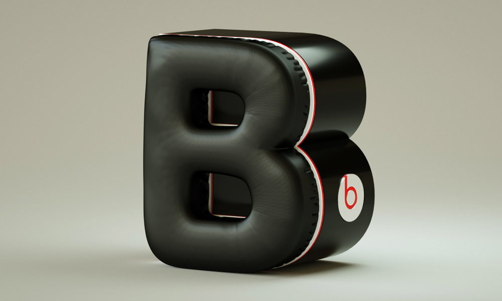
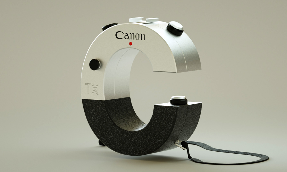
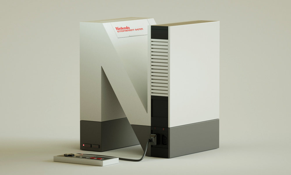
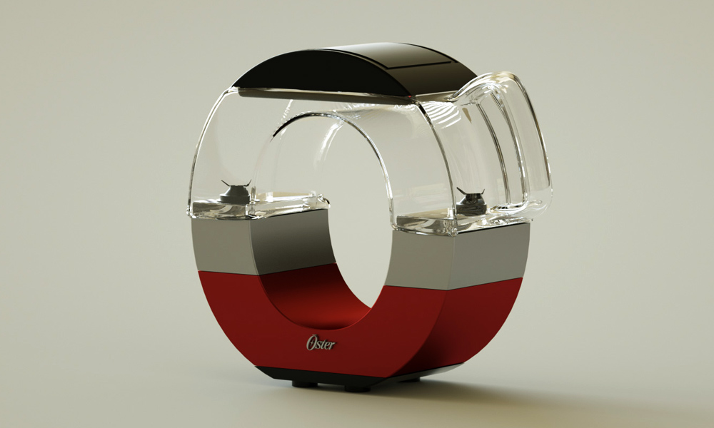
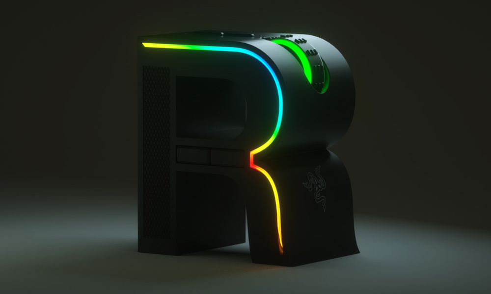
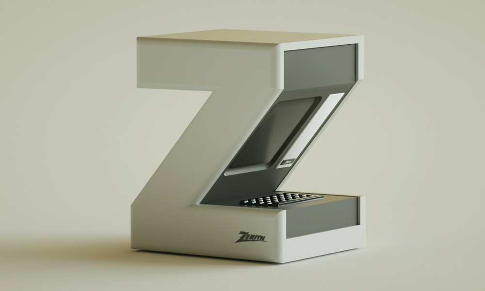
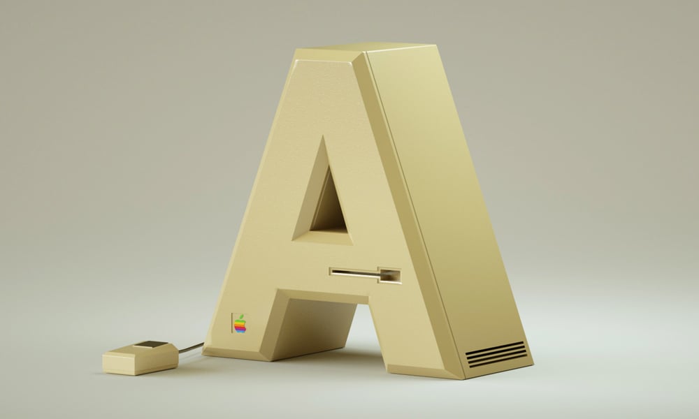
Vinicius Araujo is a Rio de Janeiro-based designer who has taken a collection of well-known brands and turned them into a font. While it’s not exactly usable for drafting a Word document, it is fun to look at. The first letter of each brand’s name is used to spell out the alphabet, so you have Apple for “A,” Beats for “B,” Canon for “C”, and so on. Araujo made sure each letter looked like a product the brand would create, down to the flashing load screen of a Dell PC running Windows XP and the old, clunky build of a Motorola. Take a scan through all the letters and see how many you can figure out.
The Electronic Alphabet Features Some of the Most Well-Known Brands
More Misc
Misc
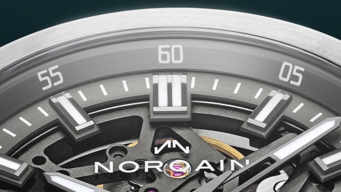
Why NORQAIN Might Be the Best Swiss Watch Brand You Haven’t Looked at Yet
Independent, family-owned, quietly earning its place on the wrists of serious athletes (Sydney Crosby, et al.) and serious collectors alike.
Misc
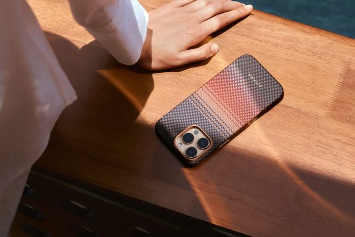
How PITAKA’s Sunset Collection Is Shaping the Future of Emotional Design
High-performance tech gear meets pure visual poetry.

Misc
Wellen Performance-Lined Swim Trunks, Reviewed by a Swim Trunk Skeptic
Could these be the shorts to end all my swimwear complaints? Tried, tested, reviewed.
-
Misc
Why NORQAIN Might Be the Best Swiss Watch Brand You Haven’t Looked at Yet
Independent, family-owned, quietly earning its place on the wrists of serious athletes (Sydney Crosby, et al.) and serious collectors alike.
-
Misc
How PITAKA’s Sunset Collection Is Shaping the Future of Emotional Design
High-performance tech gear meets pure visual poetry.
-
Misc
Wellen Performance-Lined Swim Trunks, Reviewed by a Swim Trunk Skeptic
Could these be the shorts to end all my swimwear complaints? Tried, tested, reviewed.