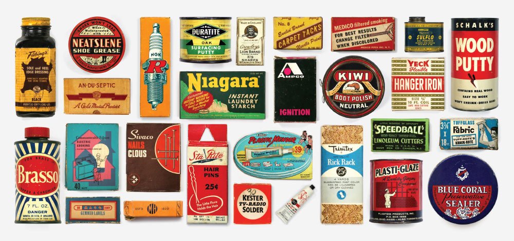
We’re suckers for great packaging. Toss a product in something with a cool font and some nice colors and you’ll have our attention. And while some items on the shelves these days make us stop and take notice, most pale in comparison to the products of yore. Don’t believe us? Check out Purveyors of Packaging, a husband and wife team dedicated to salvaging and photographing some seriously awesome examples of vintage packaging.
We sat down with Melissa, who started the project with her husband Graham, to learn why they launched the site, how they find these incredible packages, and what is it about a package that makes it stand out.
Q: So how did Purveyors of Packaging get started?
A: We’re a husband and wife team who both grew up in the Midwest and met while working together in the Chicago design industry. Our respective families instilled in us a deep appreciation for history, the importance of craftsmanship and a love of vintage items.
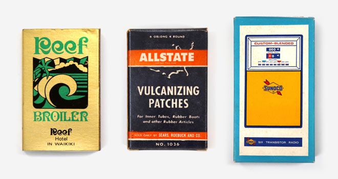
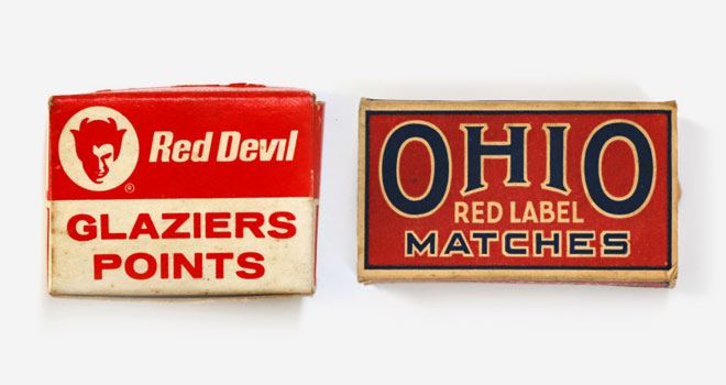
Collecting vintage packaging initially became a fun and accessible way to obtain small examples of how graphic artists were using typography, illustration and other design elements in the past. At some point during our slow acquisition of the items, we decided to start documenting them and sharing them with the community. We established rules for how we wanted to photograph the pieces, always photographed against white, and treating them as if they were museum specimens, allowing every detail to be visible. We had an enormous initial response to the images we put on Instagram and the project has continued to build momentum ever since.
Q: How do you go about finding the items? Have you had to go to any great lengths to acquire some of them?
A: The majority of the items we find at estate sales or garage sales. More recently, we have been gifted items by friends and family who are following the project and know the kind of items we look for. Some pieces live in the basements and garages of our friends and family; we will borrow them long enough to photograph them and return them. The lengths we go usually pertain to digging and unearthing items in basements and garages of sales. Our primary mission is always salvaging these items from ending up in the dumpsters.
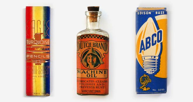
Q: What is it about a product’s packaging that catches your eye?
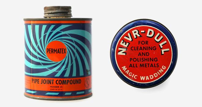
A: It’s usually a combination of interesting typography, color palette and imagery that just works. There’s no formula to what we are looking for. We are constantly inspired by the new items we find. We never go out looking for specific brands or products; we look more generally for an aesthetic and graphic quality. Each time we find a beautiful box or tin we’ve never seen or heard of, we’re reminded that with over three hundred images posted, we’ve only begun our salvaging mission.
Q: Any current brands doing packaging you love?
Graham: A lot of the new design work happening in beer is inspiring. The New Belgium redesign, the consistently strong work of Shiner and Goose Island’s Bourbon County family all come to mind. Additionally, I love the amount of heritage-inspired or ‘throwback’ design work which brands across categories are entertaining lately.
Melissa: I’m a big fan of any brand working to making their packaging more sustainable. Often that means using recyclable or compostable materials, which is sometimes a visual disconnect from the brand itself. One company that stands out from the rest is natural makeup brand Kjaer Weis. Aside from creating amazing organic makeup, the product is packaged inside a premium metal vessel that is meant to be a refillable keepsake.
Q: Do you have any favorites out of all the ones you’ve collected?
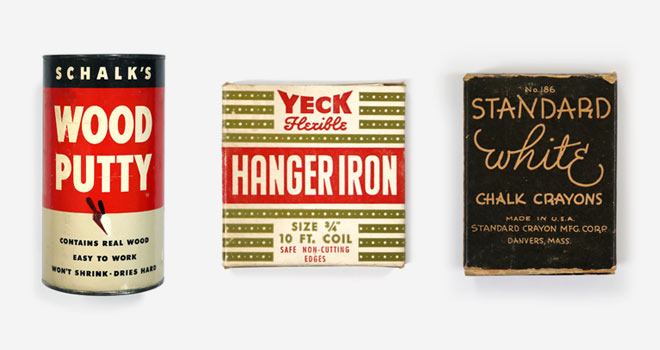
Melissa: Schalk’s Wood Putty. Yeck Hanger Iron. The Standard White Chalk Crayons.
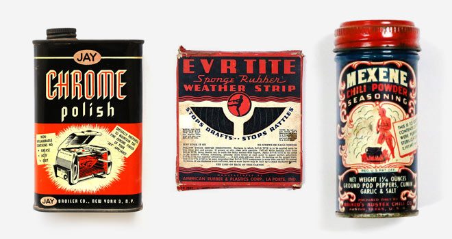
Graham: Jay Chome Polish. Ever Tite Weather Strip. Mexene Powder.
Don’t forget to follow the project at Purveyors of Packaging’s site and Instagram page.
