
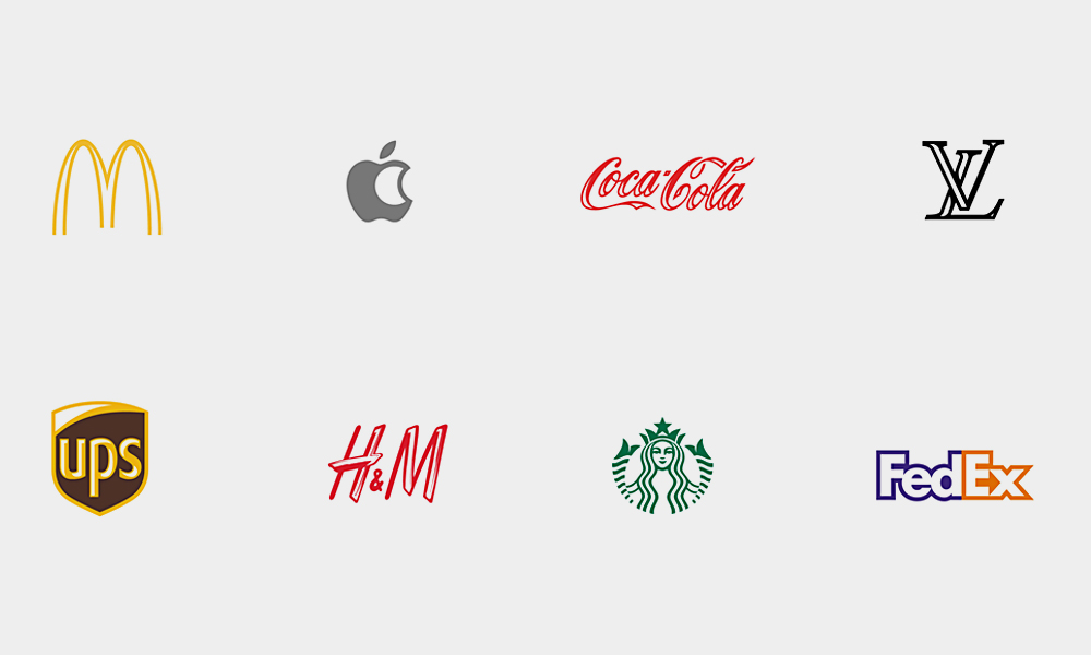
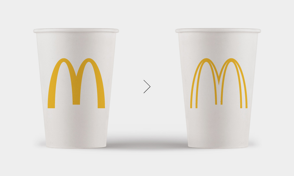
You can’t buy a coffee, put on a pair of sneakers, have a quick meal or walk more than a few blocks in most cities without being exposed to the logos of some of the world’s largest brands. How much can those famous corporate logos be changed and still be the iconic representation you’re familiar with? According to French designer Sylvain Boyer, up to 40% in some cases. After designing a birth announcement for his daughter that would have resulted in huge printing bills, Boyer went back to the drawing board to cut out colors in an effort to make it more affordable and also greener. That spark of inspiration led him to the ecobranding project, in which he takes corporate logos and puts them on an ink diet to shave up to 40% of the ink required to print each logo. Printing the Nike swoosh with 24% less ink, the Starbucks mermaid with 39% less ink or the Apple logo with 22% less ink might seem like a drop in the bucket, but these logos are printed on millions, if not billions, of things a year, so the cost savings for the brand could be huge. More importantly, the sustainable practice limits environmental impact and resource consumption, along with leaving the logos almost completely intact from a recognition standpoint.
Famous Brand Logos Redesigned to Use Less Ink
More Misc

Buildings Around the World Inspired by Birds
You can and should sleep inside a giant bird nest.
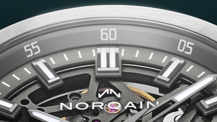
Why NORQAIN Might Be the Best Swiss Watch Brand You Haven’t Looked at Yet
Independent, family-owned, quietly earning its place on the wrists of serious athletes (Sydney Crosby, et al.) and serious collectors alike.
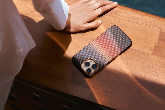
How PITAKA’s Sunset Collection Is Shaping the Future of Emotional Design
High-performance tech gear meets pure visual poetry.
-
Misc
Buildings Around the World Inspired by Birds
You can and should sleep inside a giant bird nest.
-
Misc
Why NORQAIN Might Be the Best Swiss Watch Brand You Haven’t Looked at Yet
Independent, family-owned, quietly earning its place on the wrists of serious athletes (Sydney Crosby, et al.) and serious collectors alike.
-
Misc
How PITAKA’s Sunset Collection Is Shaping the Future of Emotional Design
High-performance tech gear meets pure visual poetry.