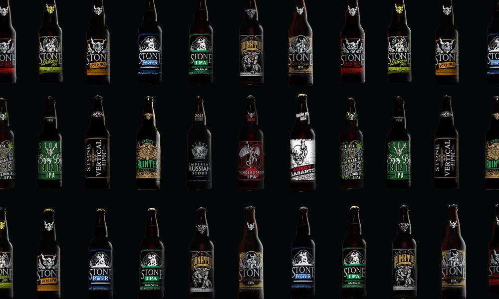
As one of the 10 largest craft breweries in the United States, Stone Brewing Co. probably has a few bottles waiting for you at your local bottle shop no matter where you live. And when you do spot one, with its stenciled gargoyle and screen-printed label, it will be distinctly Stone. We sat down with Kelly Day, Art Director at Stone Brewing Co., to hear how the SoCal brewery goes about creating new bottles, the label she’s most proud of, and the 6-pack carrier you never got to see.
CM: Before we get to the artwork, what’s the story behind the gargoyle logo?
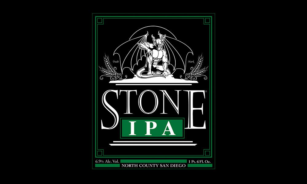
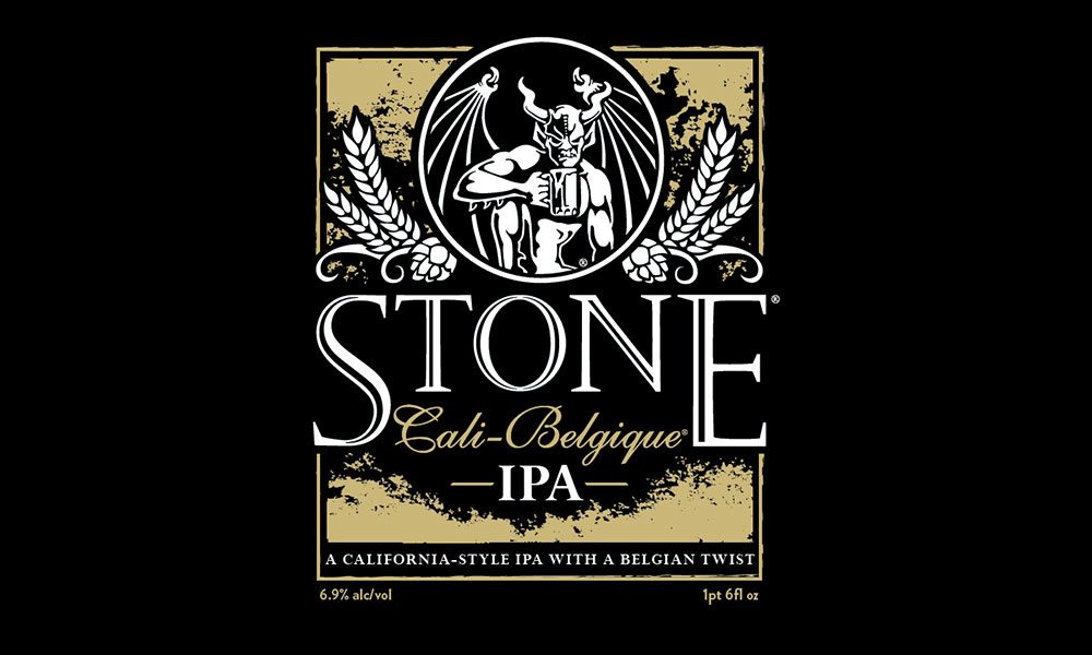
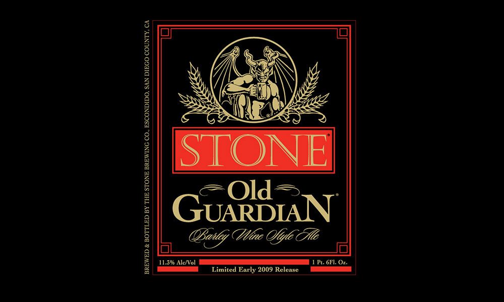
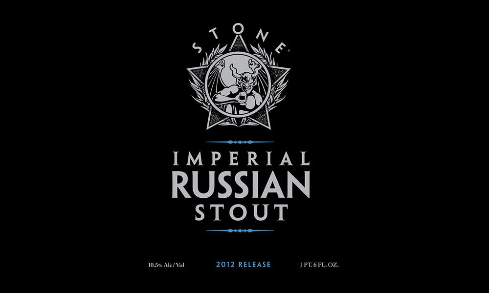
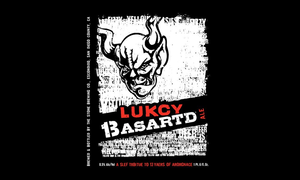
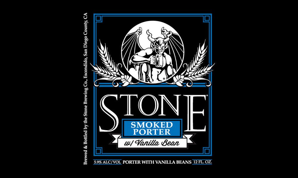
KD: As the story goes… First came the name “Stone.” Co-founders Greg Koch and Steve Wagner wanted something that conveyed a traditional European motif, just like the beers they initially planned to brew. Since gargoyles are made of stone and were seen as protectors, it seemed like a natural fit. Plus, it went hand-in-hand with Stone’s philosophy: The gargoyle warding off the modern-day evil spirits of beer, such as chemical additives, cheap adjuncts and pasteurization.
CM: How would you describe the style of the artwork on a bottle of beer from Stone?
KD: To work here you definitely have to love black and gargoyles, but we’re certainly not limited by a certain theme or color scheme. Stone Brewing Co. has a very distinct point of view, and the approach we take with packaging designs are no different. We like for every beer style to have its own look and feel. But at the same time, we aim for the packaging to have a consistent appearance that is clear when the styles are placed together on a shelf.
CM: Is it hard to get creative while staying within those lines?
KD: Not at Stone. We have a style guide, but it still gives us the flexibility to have a lot of fun with our bottle designs. We like to keep specific things on each package consistent (i.e. the placement of the logo and certain blocks of copy), but beyond these elements, the design team has a lot of creative freedom.
CM: What’s the process like for coming up with a new bottle design?
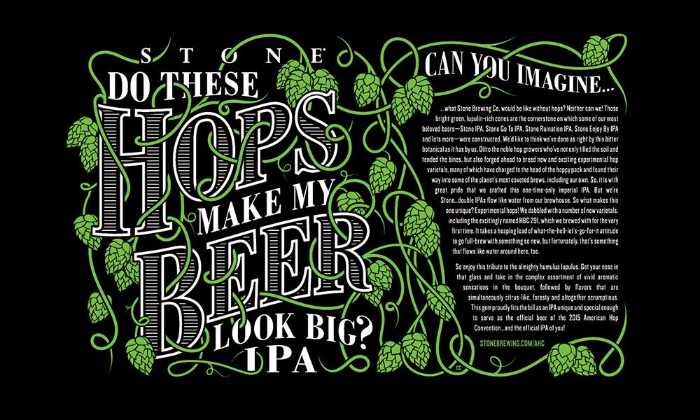
KD: We usually start the design process with the beer’s name. We have a committee of team members that are dedicated to coming up with unique beer names. They really pull out all the stops and have come up with some really fun ones from “Do these hops make my beer look big?” to “Your Father Smelt of Elderberries.” After the name is established and approved, we pull some visual inspiration and start with sketches, all before we even head to a computer.
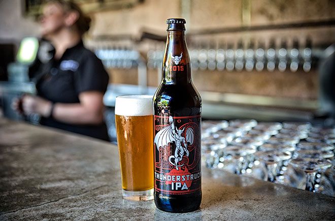
We really let the beer drive the design of each bottle—the style and name help inspire the art we create and will usually play a significant role in what the final piece looks like. For example, we recently released Stone 19th Anniversary Thunderstruck IPA, a double IPA brewed with 100% Australian hops and malt. For that bottle we incorporated an image of Australia and the design pattern was inspired by aboriginal art. In the end, the design and beer style work together really well.

CM: Are there any ideas you had for artwork that didn’t get the go-ahead that you really liked?
KD: We designed a 6-pack carrier for Bourbon Barrel-Aged Arrogant Bastard that was completely red … the entire thing, from logo to typeface. We were most excited about the potential for this package to really stand out on the shelf. In the end it wasn’t chosen, but it did inspire the final packaging to still have a lot of red and incorporate some innovative uses of spot gloss varnish.
CM: Any bottles you’re particularly proud of?
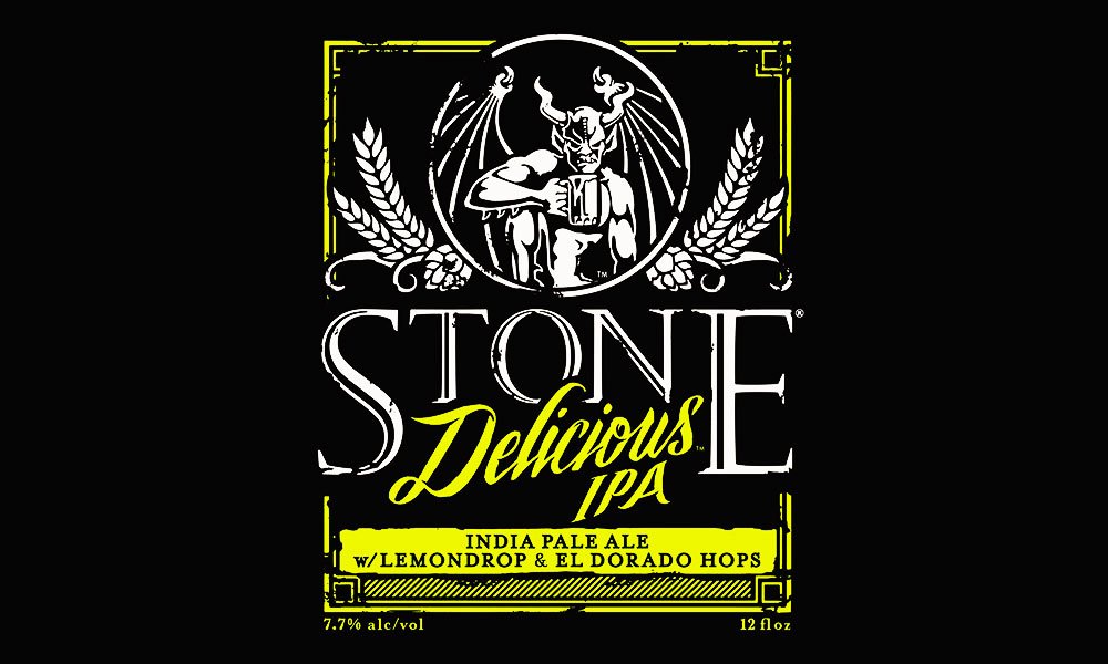
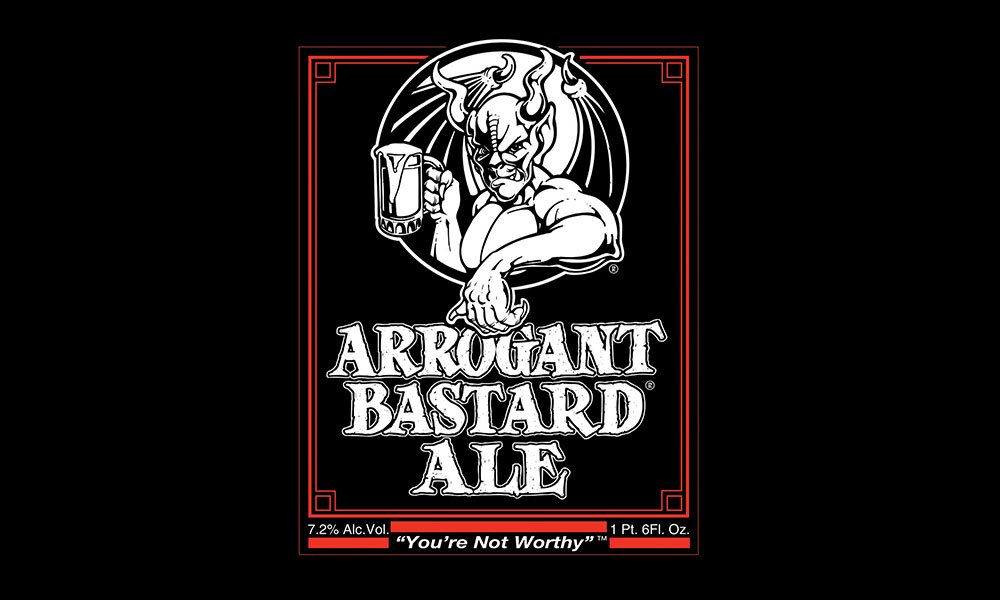
KD: The design team has created some really stunning labels for our Quingenti Millilitre series—500ml bottles of barrel-aged beers. “Double Bastard in the Rye,” a beer from Arrogant Bastard Brewing Co. that will debut in early October, is one of my current favorites.
CM: Of all the new beers released this year, which label was the most challenging to create?
KD: Earlier this year, we released Stone Pale Ale 2.0, an updated version of the first beer Stone introduced in 1996. Since the original beer was dear to a lot of our hearts, we worked really hard to come up with a design that was reflective of the original but also incorporated new traits from the revamped recipe.
CM: Any other breweries out there whose artwork you really enjoy?
KD: I’ve always admired design work from The Bruery—I love their beers, too. Boulevard Brewing Company released a series of cans this year that really helped take their brand’s look and feel to the next level.
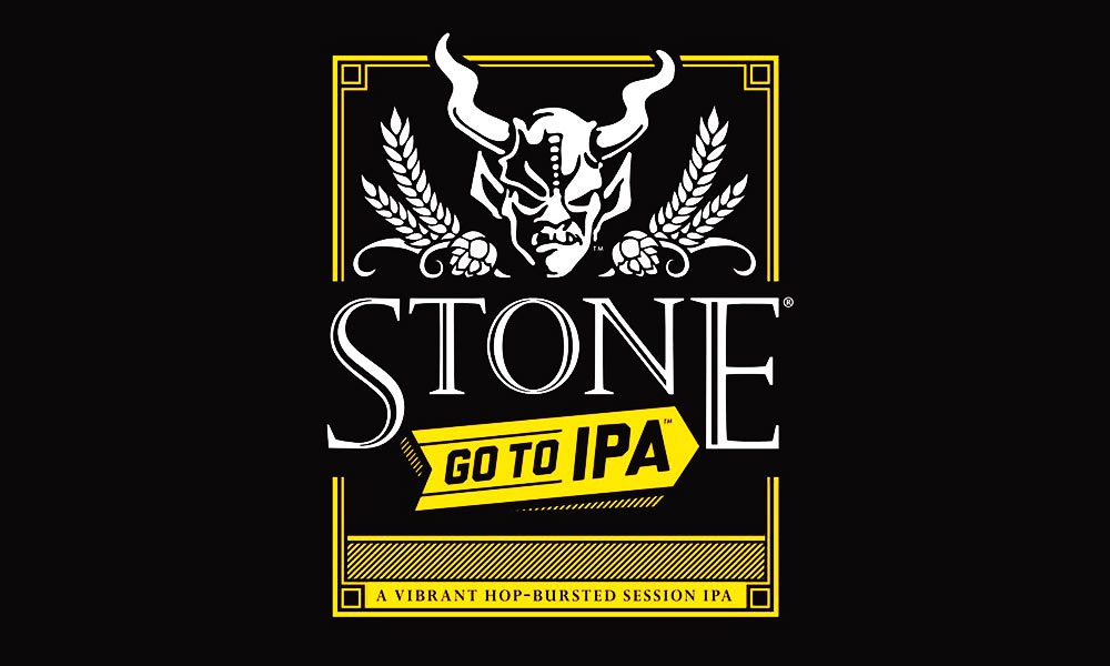
CM: What’s your go-to Stone beer?
KD: Stone Go To IPA is my favorite year-round beer. The brewing team uses a technique called “hop bursting” that gives it lots of piney, citrusy flavor with a lower ABV. It’s a session IPA, meaning I can enjoy more than one during a reasonable stretch of time.