One of the most important decisions a new brewery will make is their logo. Design impacts how we perceive things, and you never get a second chance to make a first impression. The wrong logo can easily tell beer drinkers you’re out of touch with what they’re thirsty for. So before an upstart brewery begins slinging cans and dry-hopping their IPAs, they need to settle on a logo that conveys who they are and what they’re about. Here are some of the ones who got it right. These are our favorite craft beer logos.
Brasserie-Brouwerij Cantillon
Cantillon is known for a great many things—top shelf lambics, a brewery full of cobwebs, and one of the most iconic logos in the beer world. The logo features an old man kicking back in his chair to take a drink of his beer while the pipe he was smoking falls to his side. It somehow blends both the old world style Cantillon is known for with a sense of whimsy that reminds you, Hey, beer is for getting a little buzz; don’t take it too seriously. Underneath the drinking man is often depicted the phrase “C’est bon,” which means “It’s good.” We agree.
LinkOmnipollo
Our love for Omnipollo’s artwork is well documented. But it’s not just the label art we dig so much; Omnipollo’s logo is also one of our faves. A small pyramid of hand-drawn letters form the brewery’s insignia, most likely done by resident artist and co-founder Karl Grandin. There’s an old rock band logo vibe to it, meaning it looks like a sketch you’d draw in a notebook next to AC/DC’s and Led Zeppelin’s logo while a teacher drones on about algebra.
LinkMaine Beer Company
Let’s bring this list to the epicenter of craft beer, the United States of America. And there’s something wonderfully American about Maine Beer Company’s logo. About as minimal as can be, the logo states the name of the brewery and displays a simple depiction of barley (at least we’re assuming it’s barley, as it would make the most sense). It’s a nod to what’s seemingly most important to the people behind Maine Beer Company—the environment. They’ve worked with a slew of partners like 1% For the Planet, Center for Wildlife, and the Bicycle Coalition of Maine to help protect our planet and they get that message across in a beautifully basic logo.
LinkHair of the Dog
Hair of the Dog hails from a time when most craft brewery logos looked like cheesy artwork you’d find if you typed “beer label” into Clipart. The Portland brewery should be award points for navigating that minefield and coming out unscathed. While it still displays some characteristics of its time (the brewery was founded in the early ’90s, after all), the logo plays off the name with a surly looking pooch in the middle. With each beer, the pup dons a different cap. It’s a little bit of old school for this list.
LinkNight Shift Brewing
Sticking with the animal theme, let’s discuss Night Shift Brewing out of Everett, Massachusetts, and their attractive owl logo. Not only do they brew fantastic beers, they whipped up one killer insignia, which looks hand drawn and wonderfully minimal. The owl and the name come from their humble beginnings, as the trio of founders were homebrewers who worked regular 9-to-5’s. They brewed at night and found a name that said just that.
LinkBokkereyder
Bokkereyder is a small Belgian upstart that blends lambics insanely well. Finding some to try is tough, especially stateside, as they’ve yet to ink a deal on distribution in America. That said, you should try your darndest to get your hands on some because the beer is fantastic. Also fantastic? Their logo, which, like others on this list, appears drawn by hand and rough in nature. A goat wanders next to a tree in the logo, which we assume is a nod to brettanomyces, a wild yeast that gives a distinct barnyard, goat-y aroma to a beer. That’s our guess. All we know is we dig it.
Link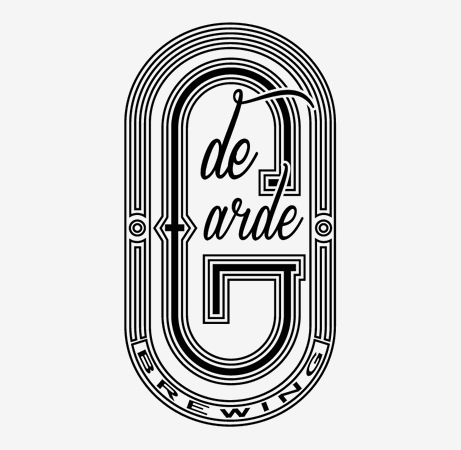
De Garde Brewing
In Tillamook, Oregon, sits De Garde Brewing, a brewery focused on producing wild ales that leverage De Garde’s incredible surroundings. Much like the aforementioned Cantillon, the folks behind De Garde believe their local microflora contribute greatly to the quality of the beer. They’re not wrong. The beer is top notch and so is the logo. The De Garde logo features a few different unique fonts that work together to produce something distinct and timeless.
LinkSurly Brewing Company
For years Surly has had one of our favorite logos. Before tons of breweries starting popping up making Northeast IPAs, Surly was there churning out the magic. The clever logo features a surly gentleman on top, his beer basically finish, and a happier guy on the bottom, with a beer that’s full and effervescent. The inverted colors and quirky design work well for us.
Link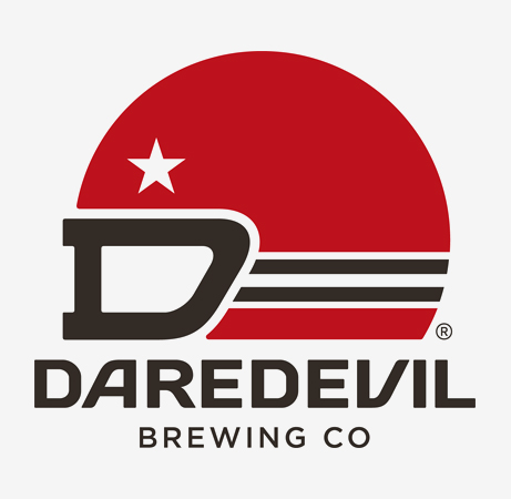
Daredevil Brewing
Most beers on this list get an “A” for logo and beer. But since this list is really all about the logo, we’re also sharing a brewery we know little about. So while we can’t give a stamp of approval to Daredevil Brewing’s beers, we can give them a thumbs up on their killer branding. Located inside the Speedway neighborhood of Indianapolis, Daredevil played off this racing theme by designing a quirky helmet with goggles.
LinkLittle Beast Brewing
With help from Chandelarrow Design Co., Little Beast Brewing concocted a slick little logo that plays off their name. New to the scene, the brewery crafts wild ales in Portland, Oregon, and, not unlike De Garde, relies on the microflora of the Pacific Northwest to help turn their wort into gold. We’ve yet to try any of their offerings, but their logo is on point and that’s a good start.
LinkGood People Brewing Company
Good People Brewing Company’s logo gives off a distinct rural vibe. The old truck just looks like something you’d see in a yard in the country. That works for a brewery in the state of Alabama, where there’s still plenty of untapped (sorry) beer potential. Good People fills that void well, producing gems like Snake Handler Double IPA and El Gordo. If you’re in Birmingham you should pay a visit—and maybe get a sticker or t-shirt while you’re there.
Link