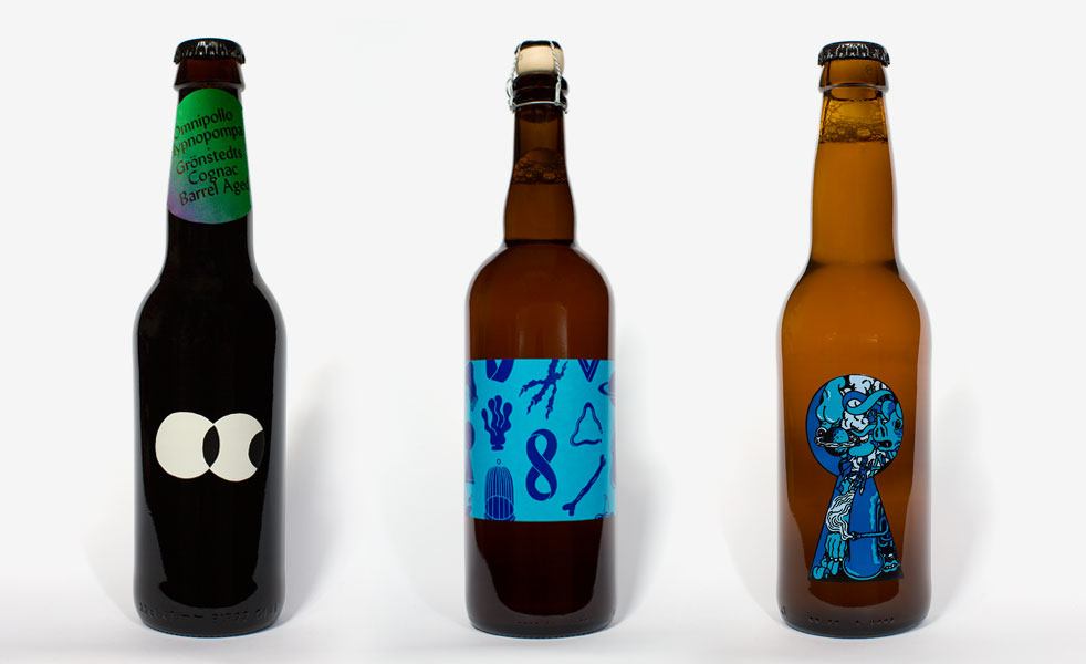
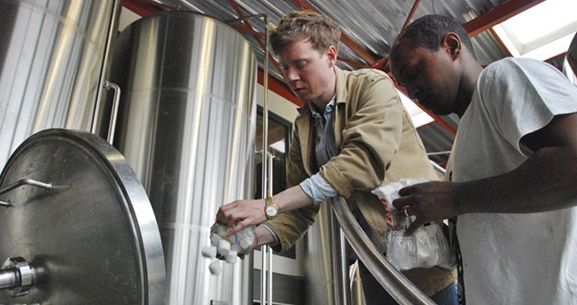
While you’re no doubt familiar with craft beer from California, Vermont, and other U.S. hotspots, you’re doing yourself a serious disservice if you haven’t sampled from some of the other small breweries that have popped up overseas. Okay, to be fair, they’re not all good, in fact some are terrible, but every once in awhile you stumble across a gem. Sweden’s Omnipollo is one of those gems. Started by Henok Fentie and Karl Grandin back in 2011, the brewery’s standout IPAs can go toe-to-toe with many legendary ones brewed stateside.
Of course, having great beer is only one part of becoming a great brewery. To get the attention of consumers, Grandin, of Cheap Monday fame, designed some killer artwork for the bottles. We spoke with him about the process and what you can expect when you see an Omnipollo beer.
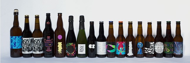
![]() Is there a common theme to all the artwork on the bottles?
Is there a common theme to all the artwork on the bottles?
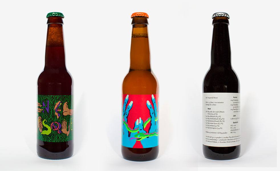
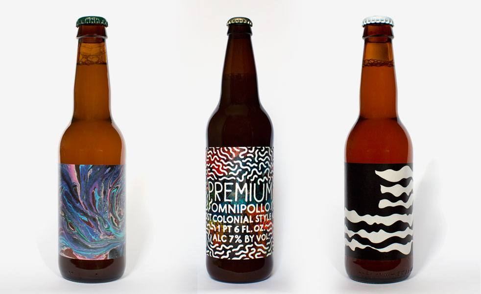
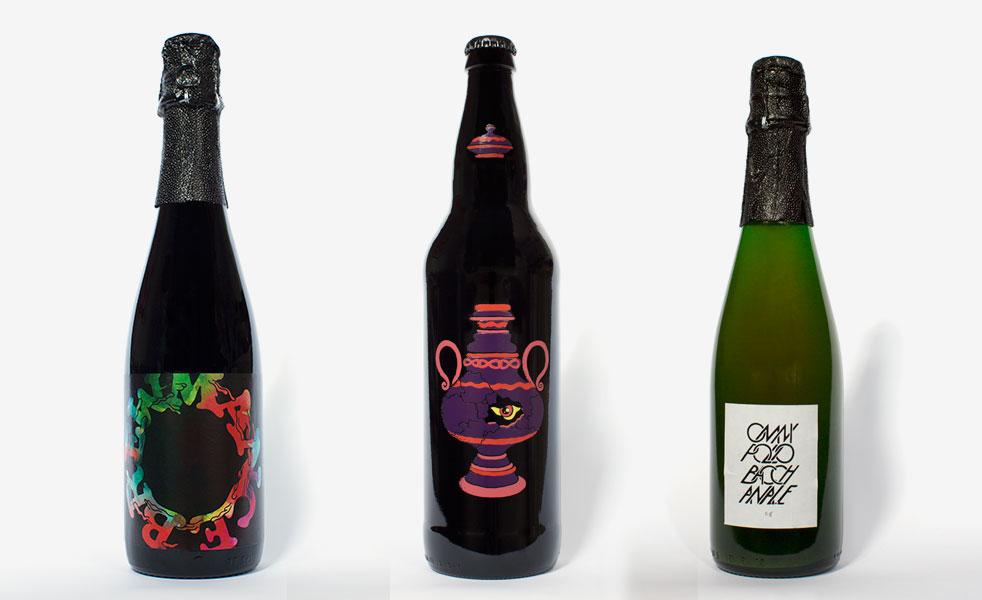
![]() Each image is part of the Omnipollo world, a trippy universe that is growing and developing, one bottle at a time.
Each image is part of the Omnipollo world, a trippy universe that is growing and developing, one bottle at a time.
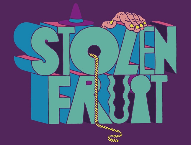
![]() What’s it like coming up with a new bottle design?
What’s it like coming up with a new bottle design?
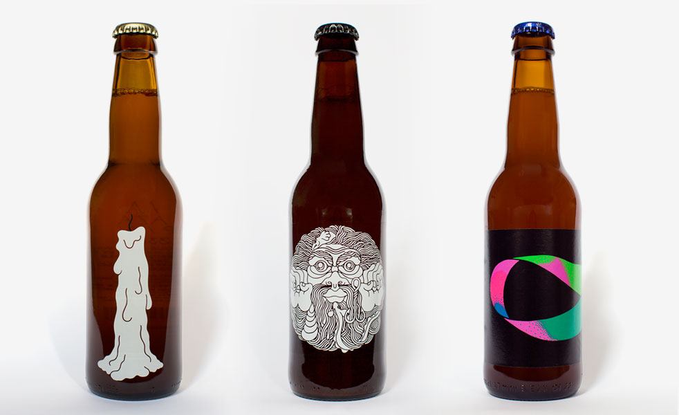
![]() Most of the images are generated from tiny drawings in my sketchbooks. Because the sketches are done intuitively and quickly, there are usually details missing, things I would have added or changed if I had researched the subject beforehand, or if I had done several versions, or spent more time working on it. These drawings tend to have a quality to them that I like—something dreamy and abstract, but also very clear, almost pictographic. I usually have a few projects going on at once and the work feeds off each other. For example, working on Omnipollo designs and making artwork for an upcoming gallery show is a good combination. The Omnipollo images often end up being part of my work for the exhibition and paintings for the show end up on labels.
Most of the images are generated from tiny drawings in my sketchbooks. Because the sketches are done intuitively and quickly, there are usually details missing, things I would have added or changed if I had researched the subject beforehand, or if I had done several versions, or spent more time working on it. These drawings tend to have a quality to them that I like—something dreamy and abstract, but also very clear, almost pictographic. I usually have a few projects going on at once and the work feeds off each other. For example, working on Omnipollo designs and making artwork for an upcoming gallery show is a good combination. The Omnipollo images often end up being part of my work for the exhibition and paintings for the show end up on labels.
![]() What about the name of the beer, does that factor into the artwork?
What about the name of the beer, does that factor into the artwork?
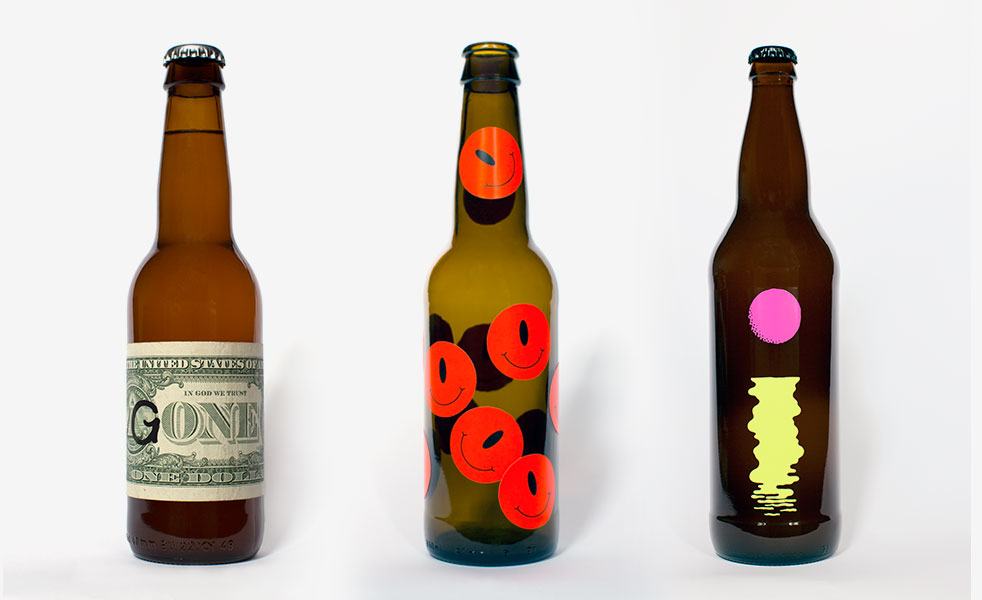
![]() I try to work freely, without really trying to describe or portray the beer itself. I like the art, the beer, the name, etc. to each mean something on their own but also to be in tune with each other. Hopefully the whole turns out greater than the sum of its parts.
I try to work freely, without really trying to describe or portray the beer itself. I like the art, the beer, the name, etc. to each mean something on their own but also to be in tune with each other. Hopefully the whole turns out greater than the sum of its parts.
![]() Has art and design been a combined interest since you started Omnipollo?
Has art and design been a combined interest since you started Omnipollo?
![]() The first time I met Henok Fentie, he was telling me about this brew he was working on and we ended up spending the whole day talking about Max Ernst, Magritte, Hieronymus Bosch, Cabaret Voltaire, and Dadaism. I’m interested in art that defies definition and try to ignore the divides between product, design, and fine art.
The first time I met Henok Fentie, he was telling me about this brew he was working on and we ended up spending the whole day talking about Max Ernst, Magritte, Hieronymus Bosch, Cabaret Voltaire, and Dadaism. I’m interested in art that defies definition and try to ignore the divides between product, design, and fine art.
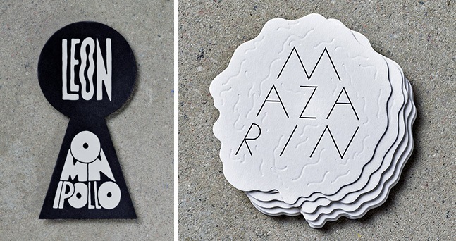
![]() Any bottles you’re particularly proud of?
Any bottles you’re particularly proud of?
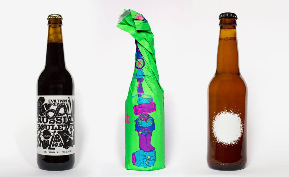
![]() Leon and Mazarin are special to me since they were the very first designs and they point in two different directions.
Leon and Mazarin are special to me since they were the very first designs and they point in two different directions.
![]() There’s no one else really doing what you guys are, but are there other breweries doing labels you really like?
There’s no one else really doing what you guys are, but are there other breweries doing labels you really like?
![]() I like the art of The Bruery, Keith Shore’s designs for Mikkeller, and Jean Broillet’s Tired Hands imagery. I hope to see more diversity and experimentation in beer packaging design in the future!
I like the art of The Bruery, Keith Shore’s designs for Mikkeller, and Jean Broillet’s Tired Hands imagery. I hope to see more diversity and experimentation in beer packaging design in the future!