The key to a great movie poster is capturing the atmosphere of the film. Those ensemble posters you see on blockbusters might satisfy actors’ agents, but for the audience, we miss out on crucial details, like genre, plot, and sometimes even the title. When we look at a poster, we should know what kind of movie we’re getting into, have a general idea of a major plot point, and what to look for when it comes time for the classic title drop.
But it seems like studios can never nail posters the same way fans can. Part of that is definitely due to regulations placed on marketing, actors jockeying for billing, and a crushing need for widespread appeal. But a fan doesn’t have to follow any of that and community-made posters end up being amazing works of art that perfectly capture the tone of the movie. Given a choice, we’ll almost always choose a fan-made poster with heart over the studio generated marketing imagery. Here are some of our favorites.

Inglourious Basterds
By Nicholas Ciaran Symes
Like Django Unchained after it, Inglourious Basterds is a revenge story, pure and simple. This poster absolutely conveys that. No audience member should have gone into that movie expecting anything other than a couple Jewish bombs destroying Nazi Germany. Let’s be clear too. The poster wouldn’t work with just one bomb, the same way the movie doesn’t work with just one revenge plot. With one, you can miss. Without the Basterds running unknowing interference, Shosanna’s plan likely would have been found out by Hans Landa. Without Shosanna’s plan, the Basterds would have been found out and disposed of in a few short minutes, without even a sliver of success. Without all of the bombs in the poster, there’s a chance the swastika will survive the onslaught. Thankfully, there are a whole cluster of bombs. Link

Stranger Things
By Livio Bernardo
Besides the ‘80s nostalgia, the thing people seem to remember about Stranger Things is Winona Ryder running around her living room with blinking Christmas lights. That’s exactly what Livio Bernardo latches onto for this poster. It’s simple and gets right to the point, using black emptiness as a stand in for the Upside Down and keeping the lights at the center of the poster. Though the lights could also look like the floating ash-like debris of the Upside Down, if you wanted to stretch your imagination a bit. The other notable thing about the poster is how rooted in the ‘80s it feels. It’s easy to imagine a young movie fan of 1983 hanging this above their bed next to an ET poster. Link

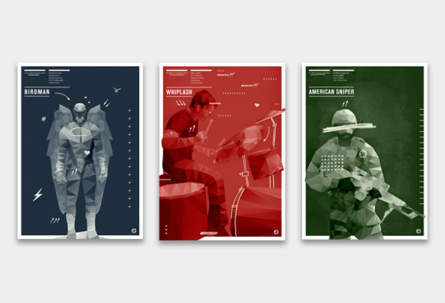
Oscar’s 2015
By Agu Mendez
Easily the best thing about this collection is how the artist blends their unique style and each of the movies featured. We’d say it feels about half and half, with neither the movie or the style making up the center of attention. Not making their ego a focal point is a respectable move on the artist’s part and it’s what kept us coming back to these posters. They could’ve become self indulgent very quickly, but instead we get to revisit 2015’s Oscar season from a new vantage point. We haven’t found any yet, but we sincerely hope there are more posters that follow the same style. We’d love to see what a Tarantino or Scorsese movie looks like with a treatment like this. Link

Batman v Superman: Dawn of Justice
By Benedict Woodhead
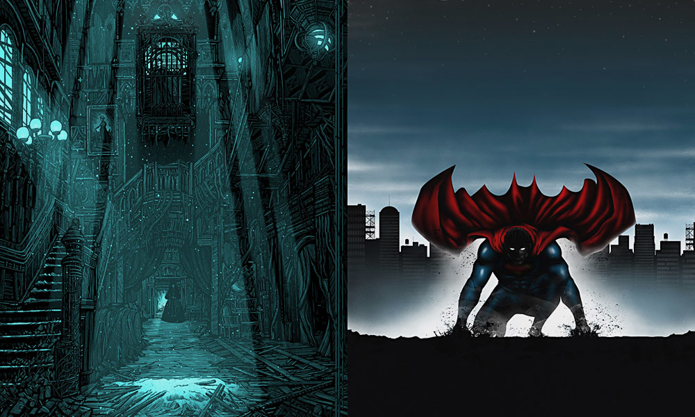
It’s undeniable that audiences were hyped up for Batman v Superman. That’s why this poster sticks out to us. It captures the anticipation we felt in the months leading up to the movie’s release, when we were imagining the pure, unadulterated excellence BvS was inevitably going to be. Turns out, awesomeness wasn’t actually all that inevitable and we had to return to print to remember why we love Batman/Superman team-ups so much. Plus the poster recognizes a core truth about the two characters. Superman is who you see in action, while Batman’s presence should only be hinted at. If the movie had followed that rule and turned Batman into an offscreen menace, we probably would’ve ended up with a much better film. Link

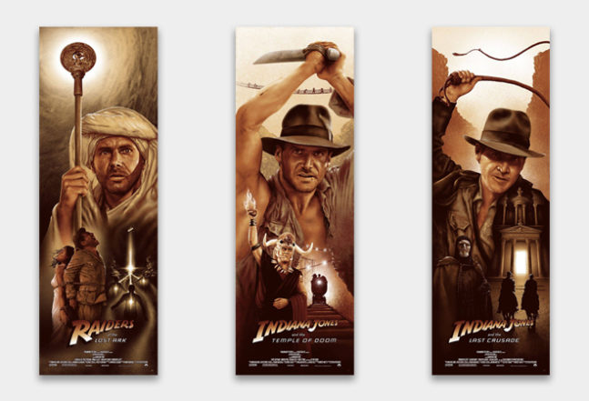
The Indiana Jones Trilogy
By Adam Rabalais
We might be bending the rules a bit on this one, since the images don’t follow traditional movie poster dimensions, but they’re so good we think a little rule bending is justified. Indy is front and center, as he should be, while our favorite parts of the trilogy are on full display. Nazis are having their souls eaten by the Ark of the Covenant, Mola Ram is holding a flaming heart above his head, and Dr. Jones Sr. and Jr. are both approaching the resting place of the Holy Grail. The posters are done in the appropriate sepia tone, and the iconic Indiana Jones font is emblazoned across the bottom. These are the perfect posters for a wholesome, well-crafted adventure franchise in its prime. Raiders of the Lost Ark | The Temple of Doom | The Last Crusade

Memento
By WeEatDesign
Part of the reason we love this poster is that it finally gives us time to actually read some of Leonard’s tattoos. The movie never really lingers on them unless Leonard is reading them or making a new one, and since his body is almost completely covered, there’s a lot of ink that doesn’t get that much attention. The other part of the reason we love it is the clutter. There’s no room for more information, which makes us wonder what would happen to Leonard if his investigation ran out of skin space. His tattoo solution is brilliant, but it’s pretty limited on real estate, especially if he’s planning on having a life after his investigation. Which, to be fair, he may not even realize is over, as the movie covers at one point. Link

The Lord of the Rings Trilogy
By Gustavo Estrella
You can describe Peter Jackson’s Lord of the Rings trilogy as a lot of things, but minimalist isn’t one of them. What is otherwise a simple good vs. evil plot is complicated by five different kingdoms, seven different major races, and so many characters you could exclusively do Lord of the Rings costumes for Halloween and die before you run out of people. But Gustavo Estrella’s posters for the trilogy distills the three movies into their crucial parts, the Ring, Two Towers, and Kingdom of Gondor. Fans of the franchise are reminded of their favorite moments in each of the installments and newcomers know exactly what to pay attention to during their inauguration. Their color schemes also closely resemble those of the DVD cases for the Extended Editions, which are the only way you should be watching those movies, other responsibilities be damned. The Fellowship of the Ring | The Two Towers | The Return of the King

The Life Aquatic with Steve Zissou
By Matt Needle
We’re not entirely sure that Matt Needle isn’t Wes Anderson’s pseudonym. It’s an unusual enough name that Anderson may have come up with it, and the poster gets so close to Anderson’s cinematic style that they might as well be the same person. The color scheme is perfect, Bill Murray’s profile has never looked so good, and Steve Zissou’s weird aquatic wildlife fills out the bottom of the frame, all exactly perpendicular to the viewer. Just looking at the poster makes us feel like we’ve rewatched the movie, and you know how much we like that movie. Link

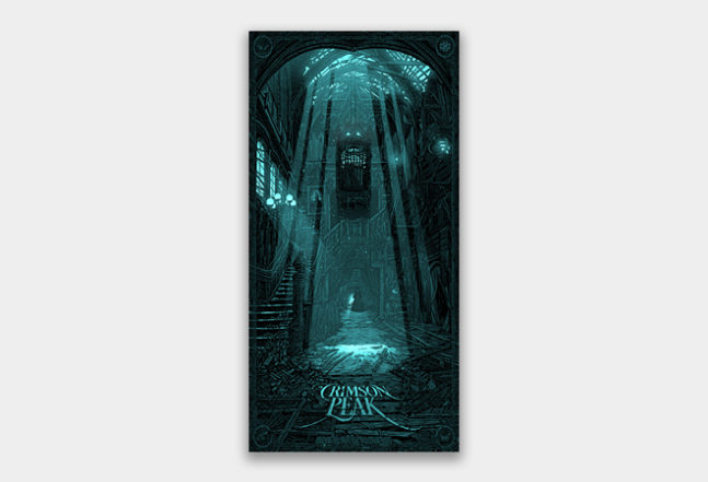
Crimson Peak
By Daniel Danger
Crimson Peak surprised us with how much we liked it. We heard almost nothing about it before its release and the only reason we ended up watching it was Guillermo del Toro directed it. But it’s easily one of the best ghost stories ever put on the silver screen. Edgar Allen Poe would be proud. For us, this poster is similar. We weren’t even thinking of the movie when we were browsing fan-made posters, but as soon as we saw it, we knew it deserved inclusion. At first glance, it’s not all that unsettling, but as you continue to look, you see more and more that’s not quite right, which is pretty much exactly how the movie works. It doesn’t quite capture the overwhelming Gothic style of the movie, but we’ll give it a pass for how well it incorporates the ghosts. Link

The Back to the Future Trilogy
By Nicolas Alejandro Barbara
Like Lord of the Rings, these three follow similar formats, each of them keeping the DeLorean dead center of the frame. It’s a beautiful way to establish consistency and continuity, made better by how each one is set in a recognizable location from its respective movie. The ‘80s hand-drawn style is great too, and not just for nostalgic reasons. Back to the Future is a series that could have only been made in the ‘80s, so any art it inspires should pay tribute to the era as well. These posters do that perfectly. Part I | Part II | Part III


