The beer bottle is dying a slow death. Today’s hottest breweries are ditching the glass and turning to the convenience and portability of the can. While we’ve mentioned a few can designs we’ve loved in the past, today there are more stunning examples than ever before. If you want a great beer in a great package, here are the breweries doing it right. These are the best beer can designs out right now. They’re a feast for your eyes and your palate.
Fieldwork Brewing
Berkeley, CA
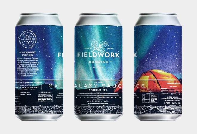
As some breweries compete to make the most minimally cool label possible—which we aren’t mad about, by the way—Fieldwork has gone in a totally different direction with the help of branding and design firm Gamut. Eschewing the minimalistic vibe found on plenty of cans for a love of nature, Fieldwork tapped incredible photography for their labels. You’ll peep forests, crashing ocean waves, and the night sky when you hit a can release at the Berkeley, California, brewery. Pick up a can of Pulp, their exceedingly aromatic and juicy IPA, and you’ll be inspired to take a hike or buy a tent. Sip on some Galaxy Juice and you’ll want to buy a telescope. Snag a can of The Meadows and you’ll feel like relaxing on your front porch with some beer and some lemonade. Link
Pure Project Brewing
San Diego, CA
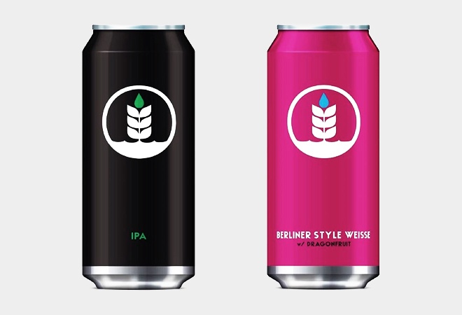
Okay, that minimal aesthetic thing we just mentioned, yeah, Pure Project is doing it right. Since part of their deal is sustainability, preservation, and, as the name suggests, purity, they outfit their cans with a logo of a growing plant and a drop of water. That logo is clean and attractive and we love the idea of using it on every can and nothing else. Different beers claim different can colors, but they all get the Pure Project Brewing logo. Their beers are solid enough to warrant a place on your radar, as we’re huge fans of Formless Reflections, their crushable IPA brewed with Nelson, Mosaic, and Hull Melon hops, along with a few others. Sometimes logos are eyesores; Pure Project Brewing gets it right—and they deserve to show it off. Link
Tired Hands Brewing Company
Ardmore, PA
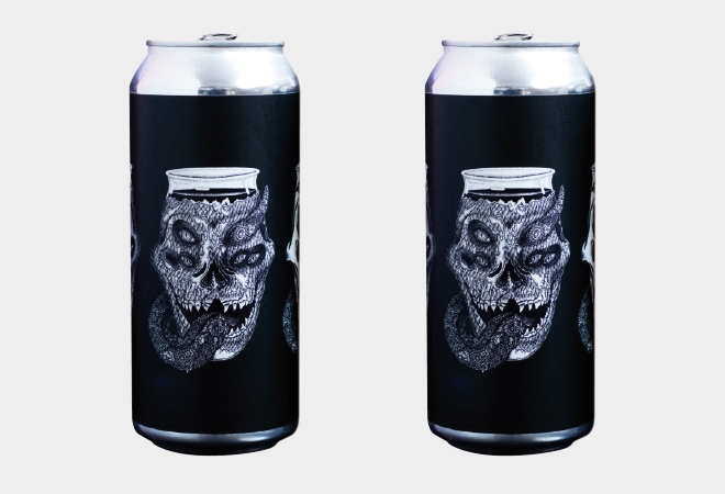
If you were to put a heavy metal t-shirt and the doodles of a super baked high schooler into a blender, you’d get a Tired Hands can. While that doesn’t sound like a compliment, it really is. If there were rules to designing a label, Tired Hands broke them, as they often team up with illustrator Mike Lawrence to make seriously unique and trippy work. With releases every week, there are a lot of great labels to choose from, but standouts include: Alien Church, Technicolor Splendor, and Helles Other People. The Ardmore, PA, brewery produces exceptionally juicy IPAs, funk-forward saisions, and curiosities in every category. Follow their Instagram page for release info and snag cans that deserve to be framed. Link
Commonwealth Brewing Company
Virginia Beach, VA
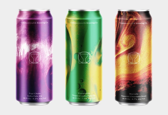
To design their incredible cans, Commonwealth Brewing Company turned to Studio Thirst, a Glasgow outfit that works mostly with companies in the beverage industry. Jeramy Biggie, the brewer and owner of Commonwealth, wanted to see the flavors of the beer on the cans they produced. That was all the direction that Studio Thirst needed. The design house photographed oils mixing with vinegar and ink to create labels that represent the dynamic range of the beers. While that sounds pretty out there, we can say the labels are just damn gorgeous. Link
Other Half Brewing
Brooklyn, NY
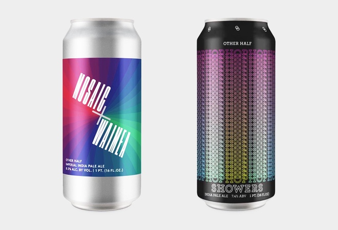
Other Half is kind of a can design OG, as they’ve been putting out sharp-as-hell cans for a few years now. The best part, they’ve never strayed from their clean vision, as old cans like All Green Everything look similar and as awesome as new cans like Nummy Nug Nug. The defining characteristic is an overall minimal aesthetic, with rich colors and simple text. Our absolute favorite is Hop Showers, which features the word “Hop” cascading down from the top of the can. Every can feels like the work of a graphic designer with their finger on the pulse. It doesn’t hurt that their beers are next level as well, with hoppy brews that marry the profiles of juicy hop bombs and a more bitter, classical IPAs. Link
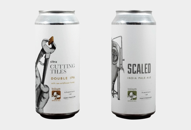
Trillium Brewing Company
Boston, MA
While a good amount of breweries on this list put out cans with minimal designs and bold, attention-grabbing colors, Trillium does the opposite. A Trillium can looks like it was plucked from a sketchbook. The image on any can, which looks like it was drawn in pencil, mirrors the name of the beer in some way. The street name series feature roughly drawn maps. Dialed In sports a telephone. Secret Stairs boasts—you guessed it—a set of stairs. So while it’s kinda easy to guess what the picture is going to be once you hear the name, that doesn’t make the art any less awesome. It also doesn’t hurt that you can pick up a print of one of the labels for your wall while you enjoy Trillium’s soft, approachable pale ales when you visit either of their locations. Link
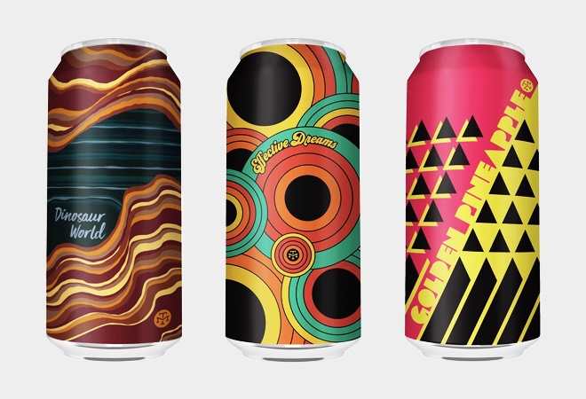
Modern Times
San Diego, CA
Modern Times has been putting out stellar beer for close to four years, but for much of that time their bottles and cans have all looked remarkably similar. Basically, they used the same label design and changed the name and color with every release. Not bad since that label is pretty nice, but it’s not exactly the most memorable design we’ve ever come across. Dinosaur World, Golden Pineapple, and Effective Dreams mark a distinct stylistic change for the California brewery. Dipping into disco styles of the 70s, Modern Times has clad these recent cans in artwork that can best be described as “groovy.” We hope this is the direction they continue to go in, because no one else is doing this and it’s really sharp. Link
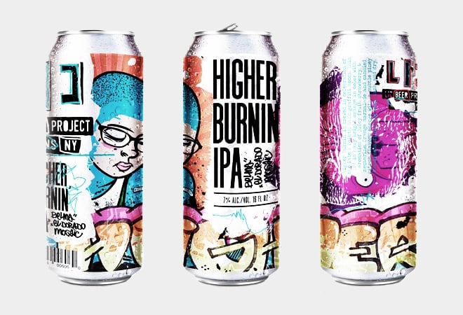
LIC Beer Project
Long Island City, NY
As breweries try harder and harder to distinguish themselves from the growing masses, we love when we stumble upon someone doing something totally original. LIC Beer Project designs labels with graffiti in mind. Each release looks freshly tagged, with bright colors scribbled all over the underlying text. It’s a nice change of pace and feels right for a brewery located in Long Island City. At just under two years old, LIC Beer Project is still in their infancy, but with IPAs like Higher Burnin’ and Party Crasher, the upstart shows a lot of promise. Of course, even if we didn’t care for their beer, the labels are sick enough to make us want to line up for every release. Link
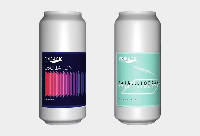
Finback Brewery
Queens, NY
Finback labels have a look that’s a bit reminiscent of Other Half, though the placement of the labels and the lack of repeating icons gives Finback their own vibe. We’re huge, huge fans of their beer and believe they’re on the cusp of great things. It doesn’t hurt that stellar beers like Moss and the Oscillation series come in such attractive vessels. Clean and slick, each can is a minimal work of art. Founded in 2011, Finback Brewery has quickly made a name for themselves and are just getting started. Link
Threes Brewing
Brooklyn, NY
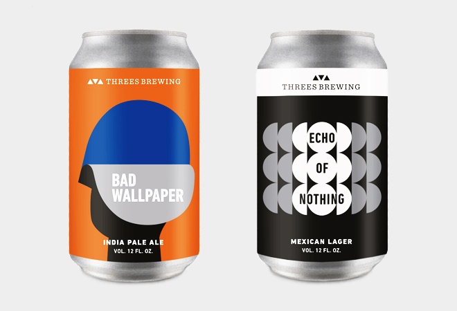
Maybe it’s just that a lot of creative types reside in New York, but it was hard not to select a handful of breweries from the city that never sleeps for this list. The final entry is Threes, a Brooklyn-based outlet that might not have the same following as some others on this list, but that’s churning out killer beer and cans that can’t be touched. Cans for beers like Unreliable Narrator and I Hate Myself have a sort of mod children’s book feel to them. The cans look like missing covers from The Schocken Kafka Library (just look and you’ll see what we mean), which is great because those books beg to be put on display. If you’re in New York, you have a lot of beer stops to make. Link
