Hours standing up, both pockets filled with quarters, puffer vest, ball cap, no need for sustenance. Yep, that was our life at the arcade in the ’80s. We never thought about the pixilated fonts everywhere in the name, the branding, on the low-res screens. This throwback book by typeface designer Toshi Omagari captures them in full color (250 typefaces, categorized and redrawn for publication), and even delivers detailed essays to educate us regarding these old-school digital typefaces. Pac-Man, Space Invaders, Galaga, and many more are covered here, spanning the ’70s, ’80s, and ’90s. The paperback edition is special enough, but you can also get a limited-edition hardback that uses a double cover, metallic ink, and will only have 1,000 printed. The irony of the present analog medium that brings us back to the digital past isn’t lost on us.
Arcade Game Typography: The Art of Pixel Type
More Misc

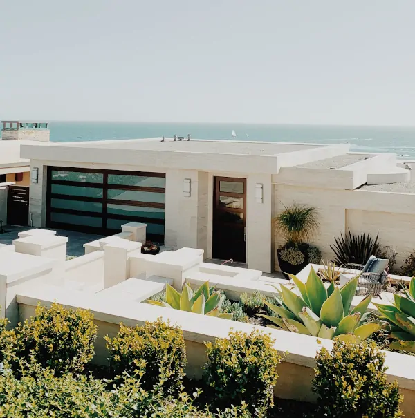
Buildings Around the World Inspired by Birds
You can and should sleep inside a giant bird nest.
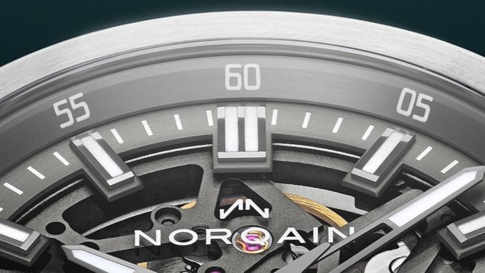
Why NORQAIN Might Be the Best Swiss Watch Brand You Haven’t Looked at Yet
Independent, family-owned, quietly earning its place on the wrists of serious athletes (Sydney Crosby, et al.) and serious collectors alike.
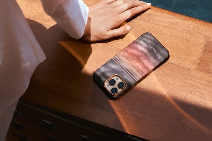
How PITAKA’s Sunset Collection Is Shaping the Future of Emotional Design
High-performance tech gear meets pure visual poetry.
-
Misc
Buildings Around the World Inspired by Birds
You can and should sleep inside a giant bird nest.
-
Misc
Why NORQAIN Might Be the Best Swiss Watch Brand You Haven’t Looked at Yet
Independent, family-owned, quietly earning its place on the wrists of serious athletes (Sydney Crosby, et al.) and serious collectors alike.
-
Misc
How PITAKA’s Sunset Collection Is Shaping the Future of Emotional Design
High-performance tech gear meets pure visual poetry.