Prairie Artisan Ales crafts some really, really good beers. If you haven’t had the pleasure, get your hands on some Bomb! or any of their farmhouse ales whenever you have the chance. One of the other reasons we dig the Oklahoma brewery is the artwork on their labels. We had the chance to talk with Colin Healey, who started the brewery with his brother Chase, about the design and direction of, not only what goes in the bottles, but what goes on them.
CM: Hey Colin, could you give us a little background on Prairie Artisan Ales in general?
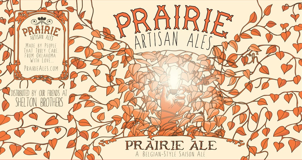
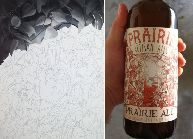
Colin: Prairie Artisan Ales is a gypsy brewing project (about to open an additional home facility) consisting of me and my older brother Chase Healey. It began around this time last year. Chase approached me with the idea of making beer labels one night and I kind of shrugged it off. I’m still in school full-time and I play classical music professionally so my schedule is kind of crazy sometimes. Anyway, later that night I came up with some dumb drawing of drunk prairie dogs and he loved it. For the first label (Prairie Ale) I adapted failed oil painting into a beer label and people seemed to like it.
CM: What’s the process like for coming up with a label for a beer?
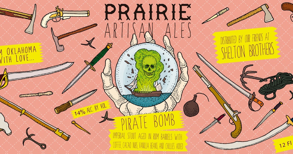
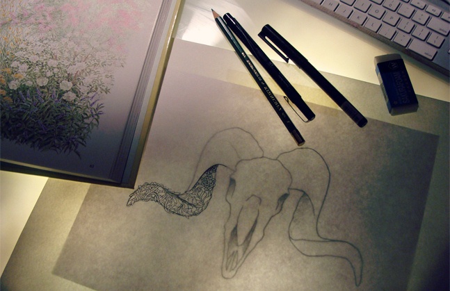
Colin: Chase usually comes to me with the name of the beer and what style of beer it is. Then he generally leaves it up to me to interpret the name and style of the beer visually. I will work in pencil and continue refining the lines with a light table. After that the inked drawings are scanned and colored digitally. Sometimes if I get a creative block we’ll go play disc golf or I’ll go for a long bike ride to clear my head.
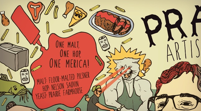
CM: Is there one you guys are particularly proud of?
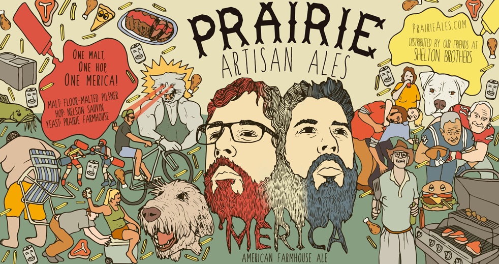
Colin: Probably the ‘Merica label just because it’s funny and full of American stereotypes. The label has meatloaf, french-fries, and pizza scattered all over it. Plus it’s an incredible beer.
CM: Are there any labels that changed drastically from the original idea?
Colin: I wouldn’t say “drastic,” but each label is tweaked in some way. I jumped into this without much experience and I think some of the labels aren’t really cohesive with the art I’m making now. Hooking up with Shelton Brothers enabled us to send beer all over the United States but it happened while I was still in the process of figuring out what Prairie is visually. My art is evolving in front of a lot of people and that has been intimidating. Now that I feel more comfortable in what I’m doing I’d like to slowly reformat and revamp the older labels.
CM: How important is getting the label “right” to you and Chase?
Colin: Haha, I’m not sure if I ever got it “right” in the first place. As long as it’s not terrible and says the things it needs to say. I love design but don’t know a whole lot about it. I really admire guys like Keith Shore from Mikkeller and Karl Grandin from Omnipollo for their design and illustrations. They are both doing very innovative things for the industry and they make it look so effortless! I had the chance to meet them this summer and they pretty much told me that the less I know about design, the better. I guess it’s easy to over-think things sometimes.
CM: Anything you guys are working on right now?
Colin: Our Tulsa-based brewery will be opening soon so I have been working on labels for beers that will only be produced at that location. One of those beers is Prairie Weisse, which will be a sour wheat beer. The local and national beer community have been very welcoming. We are looking forward to making more friends and to helping establish a greater reputation for beer in the midwest.
